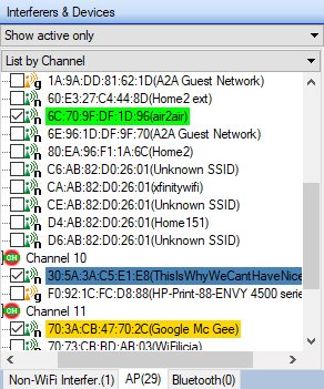
You’re offline. This is a read only version of the page.


| Spectrum Density – Displays where in the band stable, repeating signals has been detected When a session is started, this graph begins to build up data points over time to show where and how often power levels are detected along the frequency range. The color coding indicates the relative percentage that a power level has been repeatedly detected since the beginning of the session. this graph view is useful as it provides a view which shows where in the WLAN environment, stable repeating signal levels are detected and where the signal jumps around more, which could indicate potential sources of interference. 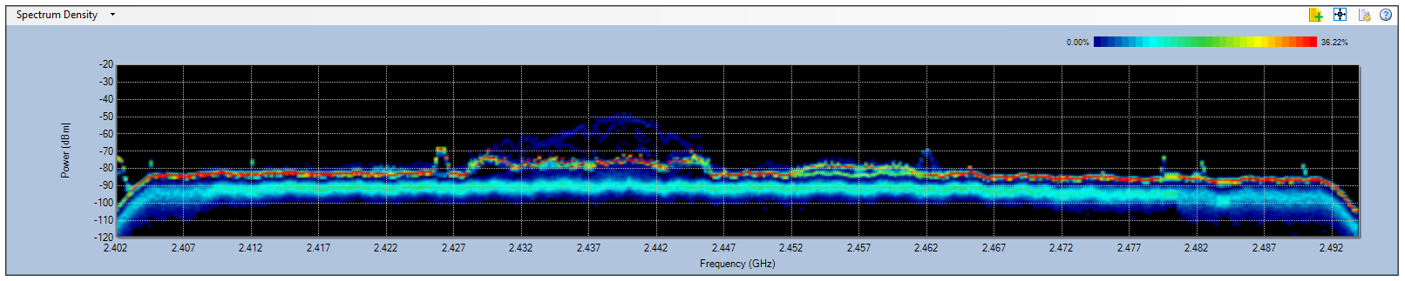 The scale will automatically adjust based on the relative percentage detected. The upper end of the legend, shown in red, indicates the highest percentage of recurring power readings during the current session, and the lower end of the legend, shown in blue indicates the lowest percentage of recurring power readings. For example, the upper end of the legend shows 36%. This means if there were to be 100 sweeps since the session began, the most consistent power readings had occurred 36 times. In this case, there would be a red density mark on the graph where this recurring energy level occurred. Note: The session can be reset by clicking the Reset Data icon on the toolbar. 
Viewing AP Signal Strengths Across the Frequency Range Signal strength of APs selected from the Device List on the left can be displayed over the Spectrum Density graph in the form of curves across the corresponding frequency range used by the APs. The selected APs will be highlighted with a color in the tree view with a corresponding curve displayed in the Spectrum Density chart. 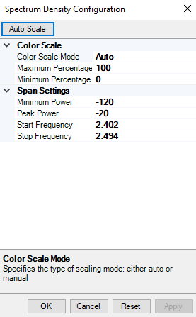 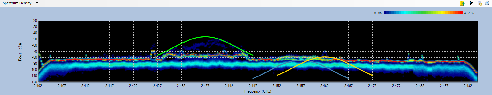 Note: The AP signal strength curves are based on WiFi data captured by the wireless network adapter in use. It may not completely match the data in the Spectrum Density Chart. As shown above, AP signal strengths, as represented by the colored curves, appear higher than the maximum signal strength shown in the Spectrum Density graph. This is because AP signal strengths are based on RSSI data captured by the wireless adapter. While RSSI is usually calculated over a packet or averaged over multiple packets, RF power as measured by the spectrum analysis engine includes packets and background noise, plus RF silence in between the packets. This is the reason the RSSI value (the AP curve) differs from the peak of the spectrum graph for the same AP. |