

Spectrogram –
Historical Performance of the Spectrum
The Spectrogram graph provides another way to present the data as shown on the Real-Time FFT chart. It displays the changes in the spectrum over a period of time and identifies any shift in frequency use along with the duration of such shifts. The X-axis shows the frequency range covered by the selected radio band and the Y-axis shows, in real time, the number of sweeps the spectrum adapter scans the RF spectrum. It displays the historical performance of the spectrum over the last few minutes and can maintain, for a short while a record of events, that a user could potentially miss in other graphs. It is also useful for picking out patterns in the detected data transmissions and determining if a signal is background noise or an interference source

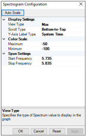
Each time the AirMagnet spectrum adapter scans the RF spectrum, it is called a sweep cycle. This graph adds one color-coded line to the base of the graph with each sweep cycle. This begins to build up data as new data appears. By default, the new line appears at the bottom and pushes up the old data. This graph will display up to 250 sweep cycles. After this, the oldest sweep cycle is discarded as a new cycle appears. The color legend in the upper right corner of the graph indicates the minimum power values which are shown in blue and the maximum power values which are shown in red.
Chart Configuration

Display Settings
Color Scale
Span Settings: